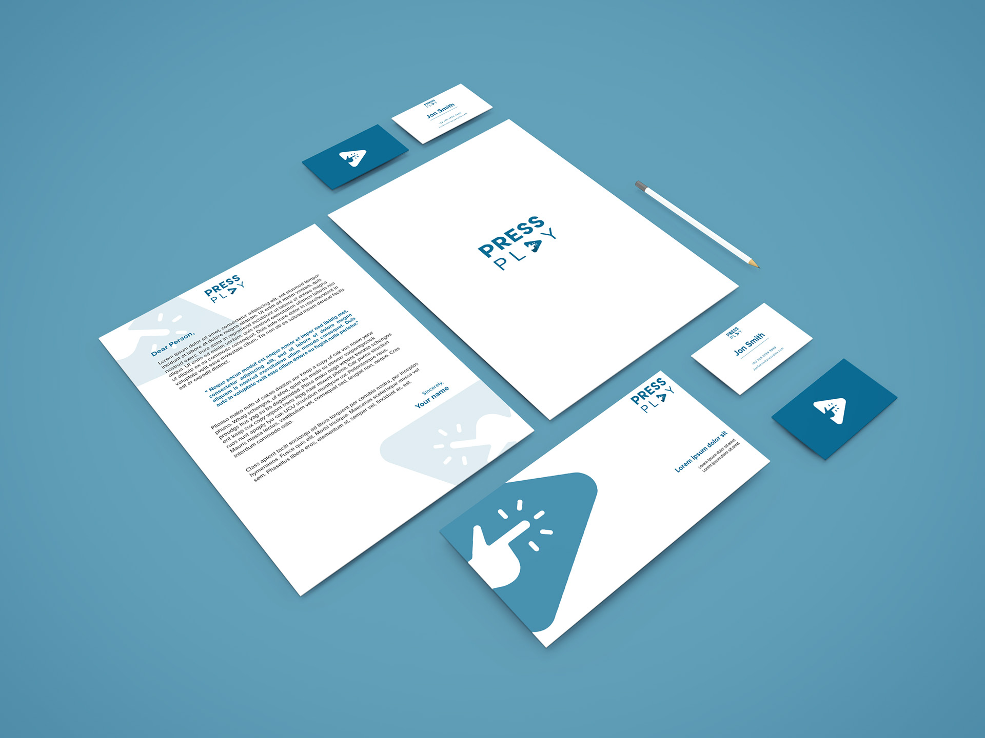
Branding exercise for a small online shop. With a branding mock up complete with letterhead, Letter cover, and sample business card.
I used a simple duo-chrome color scheme. And since the blue color can present a calm vibe, (Facebook, Twitter, Skype, etc.) that same color would go good with the branding.
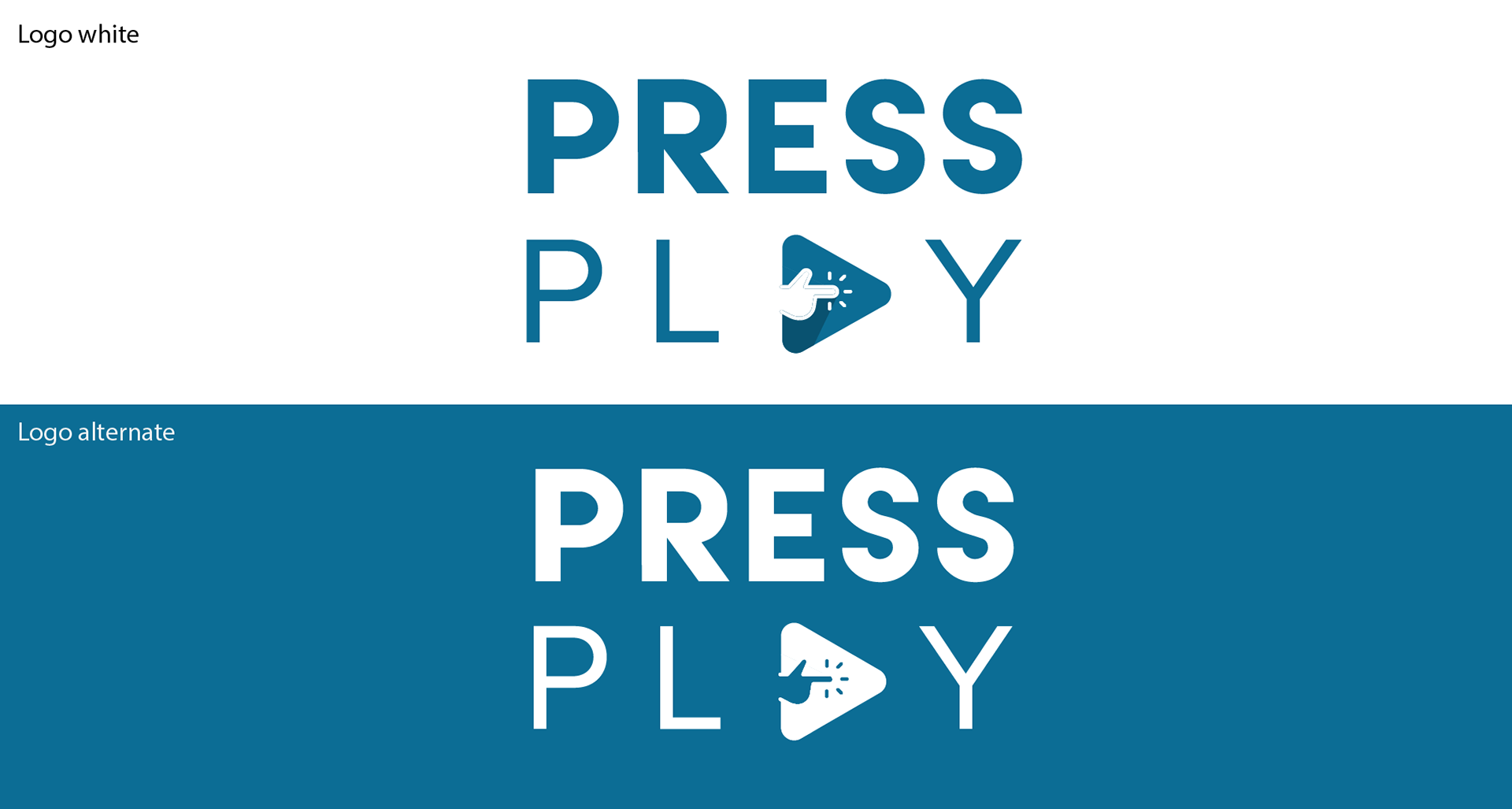
As far as loco and icon, it was meant to be simple, and easily integrated into the words of the company. With the way it is placed, people would naturally read it as it should be. Otherwise, looking at the icon alone is enough to create a sort of easy association with the company name.


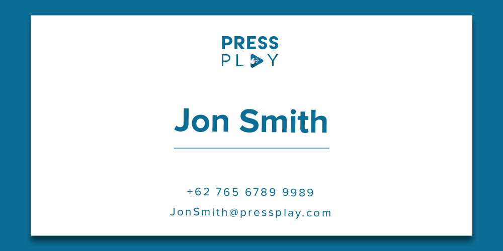
Some collateral business materials, mainly Sample letter, business card, etc.